CivicAPR 8, 2024
Interior Inspirations For Every Stylish Home: Design Tips & Ideas

 Insights, Ideas, and Inspiration

Color profoundly influences our emotions, behaviors, and perceptions. Understanding color psychology allows designers to create spaces that not only look beautiful but also support the intended mood and function of each room. Explore how different hues can transform your living environment.
Warm colors—reds, oranges, and yellows—evoke feelings of warmth, energy, and optimism. Red stimulates appetite and conversation, making it ideal for dining areas when used thoughtfully. Orange promotes enthusiasm and creativity, perfect for home offices or playrooms. Yellow brings cheerfulness and mental clarity, brightening kitchens and entryways. Use these colors strategically as accents or in spaces where energy and activity are desired.
Cool colors—blues, greens, and purples—create calming, serene environments. Blue lowers blood pressure and heart rate, making it excellent for bedrooms and bathrooms. Green, associated with nature, promotes balance and relaxation in any space. Purple combines the energy of red with the calm of blue, offering sophistication and creativity. These hues work beautifully in spaces dedicated to rest, reflection, or concentration.
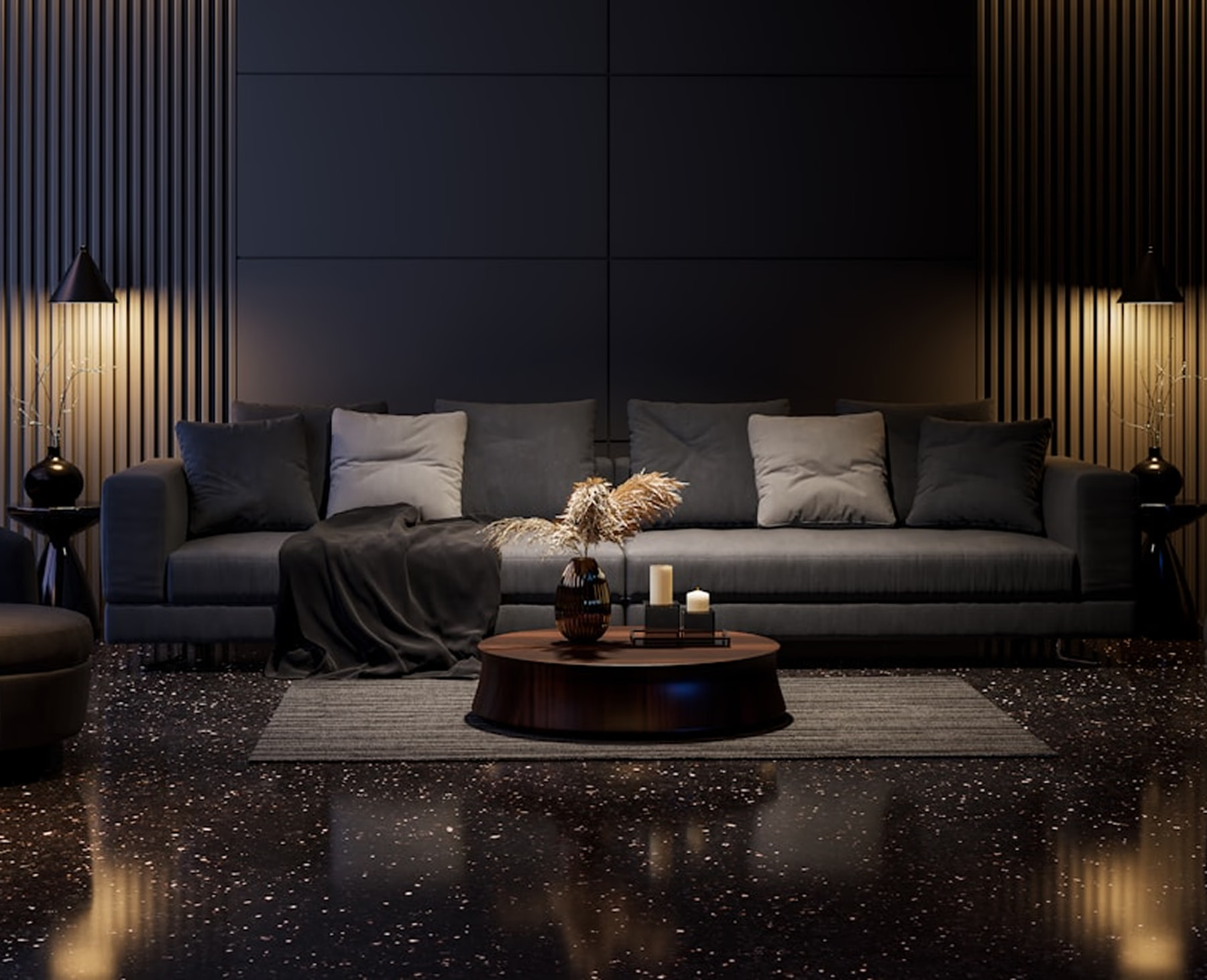
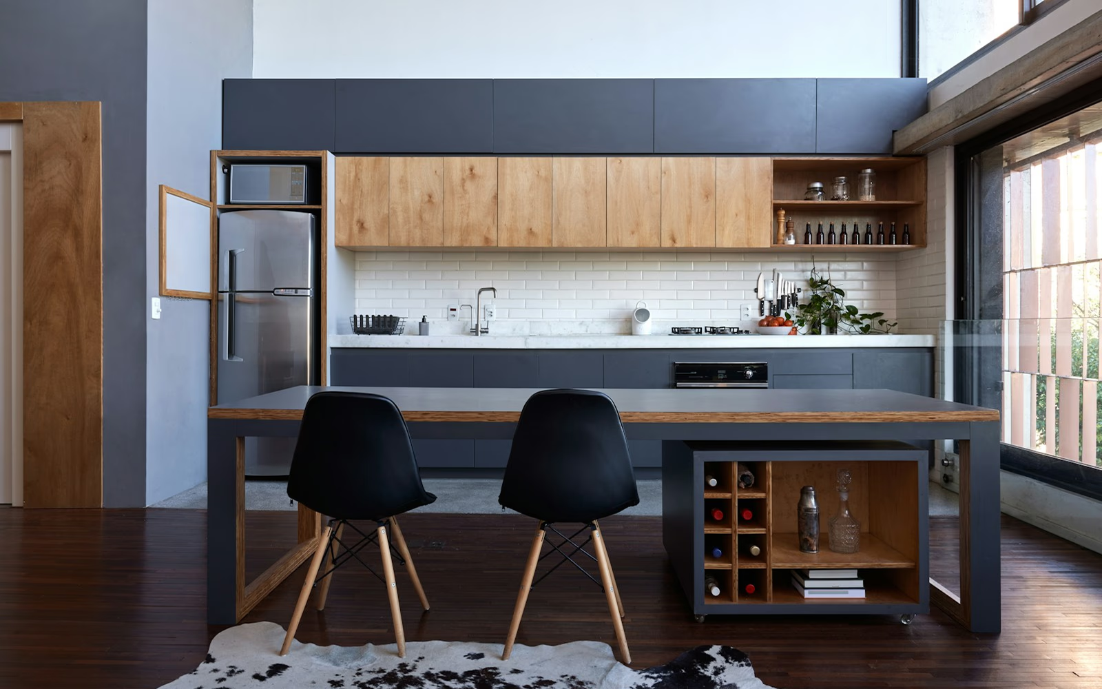
Neutrals—whites, grays, blacks, and beiges—provide versatile foundations that support other design elements. White creates openness and cleanliness, gray offers sophistication and balance, while black adds drama and depth when used sparingly. Warm neutrals like beige and taupe bring coziness without overwhelming. Neutrals allow flexibility in decorating and provide visual rest between bolder elements.